

With so many colorwork patterns available at the moment, choosing the perfect color combinations can seem quite daunting. Of course, you could go with the shades in the given pattern, but this is almost certainly not going to suit every knitter. Therefore, we need to consider such things as favourite colors and colors that suit
With so many colorwork patterns available at the moment, choosing the perfect color combinations can seem quite daunting. Of course, you could go with the shades in the given pattern, but this is almost certainly not going to suit every knitter. Therefore, we need to consider such things as favourite colors and colors that suit the recipient, and couple these with colors that work well together. Armed with a basic knowledge in color theory we can make better informed decisions when choosing the right shades of yarn for a project. To begin with, we’ll take a look at color theory and what it means in relation to choosing colors that work well together.
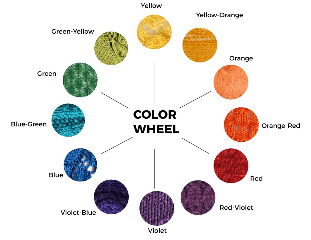
Firstly, we’ll explore the color wheel. The color wheel includes primary, secondary and tertiary colors. Primary colours are our basic red, yellow and blue. Secondary colors are achieved by mixing these colors and extending the palette to include orange, green, purple. Tertiary colors are created by further mixing, which gives us yellow-orange, red-orange, yellow-green, blue-green, red-purple, blue-purple. And, of course, these can be lightened or darkened to give varying shades and hues in between.

Let’s examine the various themes and look at what can be achieved by using those different themes.
Complementary Color
Complementary colors are opposite each other on the color wheel. Choose any color from the color wheel and and pair it with it’s opposite. These are colors that show good contrast and bounce off each other. It’s worth mentioning here, that large areas of an all-over pattern, using complementary colors, can be a quite energetic. Changing the hue can help tone down the contrast a little, so it’s also worth experimenting with different hues to find a combination that works for you.
Analogous Color
Analogous (neighbouring) colors are colors, typically from the same family, that harmonise well together and can consist of three or more colors. Analogous colors can be used to create a gradient effect and, if you’re feeling really adventurous, you could add a pop of color by including a shade from the opposite end of the color wheel!
Split Complementary
Split complementary colors are a variation on the the complementary color theme, but instead of two colours, you’ll be adding a third. The key to choosing from the split complementary theme is to start by choosing a base color from the color wheel. The other two colors are determined by the two colors adjacent to the base colors complementary (or opposite) color. Like the complementary theme, this combination gives strong visual contrast, but the tension between the colors is eased by the introduction of the third colour.
Triadic (triangular)
Triadic colors are three colors that are evenly spaced on the color wheel. This combination tends to be quite lively. When using this combination it might be an idea to consider how vibrant you want the garment to be – equal amounts of each color will make for a very lively garment, but this can be subdued simply by using one of the colours as a dominant colour and using the other two as accents. Try experimenting with different hues to find a combination that works for you.
Tetradic (rectangular)
Colors chosen from the Tetradic scheme consist of a combination of four colors, combining two sets of complementary colors. This theme will give a palette of rich shades and offers a good range of variations. Again, it is well worth experimenting with this scheme in order to find a good balance.
Square
A square color scheme is similar to the rectangular color scheme, but instead, the colors are evenly spaced on the color wheel. The effects can be similar to the rectangular theme so, again, experimenting is the key to finding the right balance.
Here are some knitted examples of the Complementary, Split Complementary and Analogous schemes mentioned.
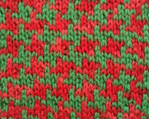
Complementary
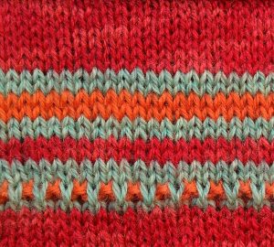
Split complementary
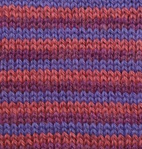
Analogous
Choosing colours for a colorwork project doesn’t have to be a headache. Each of the schemes mentioned offers a myriad of possibilities with endless variations. Many combinations are easily attainable by experimenting with different colors and hues. The more you experiment, the more confidence you’ll have when choosing color combo’s. Play around with the various themes. Explore the many combinations until you find one that works for you. Honestly, whether you want to clash or harmonise, the possibilities are endless.
And, one thing to remember is that all of these schemes can be applied to pastels as well as deep tones and brights – it’s simply a matter of hue and personal taste.
Well, what you waiting for? Grab your favourite colorwork project and start playing with the color wheel! 